Left Side. This column is six grid units wide. Both the left and right columns are the same relative width.
Right Side. This column is six grid units wide. Both the left and right columns are the same relative width.
These are notes by Jim Pickrell on how to use Bootstrap. They are succinct as possible. View source to see how the examples work.
The original Bootstrap source is available here: http://getbootstrap.com/getting-started/#download
Insert these lines in the header of your page. They link to remote copies of the Bootstrap and Jquery files. If you do this you don't need to have your own copy of the bootstrap files.
<meta name="viewport" content="width=device-width, initial-scale=1">
<link rel="stylesheet" href="http://maxcdn.bootstrapcdn.com/bootstrap/3.3.5/css/bootstrap.min.css">
<script src="https://ajax.googleapis.com/ajax/libs/jquery/1.11.3/jquery.min.js"></script>
<script src="http://maxcdn.bootstrapcdn.com/bootstrap/3.3.5/js/bootstrap.min.js"></script>
The Bootstrap method for layout is called "grid". The screen layout is divided into twelve columns ("grids"). When you create an object, you can decide how many of these columns to use by usin a class such as "col-xs-1". The grid should be placed inside a div with class="container" or "container-fluid".
Here's all twelve columns separately. Make the browser window narrower and wider to see how the columns move around.
The code looks like this
<div class="container">
  <div class="row">
    <div id="" class="col-xs-1" style="border: thin solid black">
      Col 1
    </div>
    <div id="" class="col-xs-1" style="border: thin solid black">
      Col 2
    </div>
    <div id="" class="col-xs-1" style="border: thin solid black">
      Col 3
    </div>
    <div id="" class="col-xs-1" style="border: thin solid black">
      Col 4
    </div>
    <div id="" class="col-xs-1" style="border: thin solid black">
      Col 5
    </div>
    <div id="" class="col-xs-1" style="border: thin solid black">
      Col 6
    </div>
    <div id="" class="col-xs-1" style="border: thin solid black">
      Col 7
    </div>
    <div id="" class="col-xs-1" style="border: thin solid black">
      Col 8
    </div>
    <div id="" class="col-xs-1" style="border: thin solid black">
      Col 9
    </div>
    <div id="" class="col-xs-1" style="border: thin solid black">
      Col 10
    </div>
    <div id="" class="col-xs-1" style="border: thin solid black">
      Col 11
    </div>
    <div id="" class="col-xs-1" style="border: thin solid black">
      Col 12
    </div>
  </div>
</div>
Let's make a layout that was divided in half, 50% to the left and 50% to the right. That's 6 columns on the left side and 6 columns on the right. That looks like this:
The code looks like this
  <div id="main-container" class="container">
    <div class="row">
      <font color=red>
        <div id="" class="col-xs-6" style="background-color: #cfc">
          Left Side.  This column is six grid units wide.  Both the left and right columns are the same relative width.
        </div>
        <div id="" class="col-xs-6" style="background-color: #ffc">
          Right Side.  This column is six grid units wide.  Both the left and right columns are the same relative width.
        </div>
      </font>
    </div>
  </div>
You can make the screen of your browser wider and narrower to see how the text moves around. View the source to see how this works. The example above has six columns left, six columns right. Let's try it with 3 and 9.
The code looks like this
sample code
This next example is a fluid layout, which goes all the way to the edge. Open the screen wide to see this effect.
The code looks like this
<div class="container-fluid"> <font color=red> <div class="row"> <div id="" class="col-xs-3" style="border: thin solid black"> 3 columns </div> <div id="" class="col-xs-9" style="border: thin solid black"> 9 columns </div> </div> </font> </div>
You can use the mark tag to
highlight
text.
This line of text is meant to be treated as deleted text.
This line of text is meant to be treated as no longer accurate.
This line of text is meant to be treated as an addition to the document.
This line of text will render as underlined
This line of text is meant to be treated as fine print.
rendered as bold text
The code looks like this
<h2>Text Styles</h2>
<p>You can use the mark tag to <mark>highlight</mark> text.<br>
<del>This line of text is meant to be treated as deleted text.</del><br>
<s>This line of text is meant to be treated as no longer accurate.</s><br>
<ins>This line of text is meant to be treated as an addition to the document.</ins><br>
<u>This line of text will render as underlined</u><br>
<small>This line of text is meant to be treated as fine print.</small><br>
<strong>rendered as bold text</strong></p>
Left aligned text.
Center aligned text.
Right aligned text.
No wrap text will not wrap even if the screen gets very narrow. The excess is dropped off the end and will not be visible unless the page gets wider.
The code looks like this
    <h2>Text Alignment</h2>
    <p class="text-left">Left aligned text.</p>
    <p class="text-center">Center aligned text.</p>
    <p class="text-right">Right aligned text.    </p>
    <p class="text-nowrap">No wrap text will not wrap even if the screen
      gets very narrow. The excess is dropped off the end and will not be
      visible unless the page gets wider.</p>
If you want Bootstrap styling on a table, start by putting class=table for the table. Here's an example.
| one | two |
| three | four |
| five | six |
The code looks like this
    <table class="table">
      <tr>
        <td>one</td>
        <td>two</td>
      </tr>
      <tr>
        <td>three</td>
        <td>four</td>
      </tr>
      <tr>
        <td>five</td>
        <td>six</td>
      </tr>
    </table>
There are several styles available such as:
| one | two |
| three | four |
| five | six |
| one | two |
| three | four |
| five | six |
| one | two |
| three | four |
| five | six |
| one | two |
| three | four |
| five | six |
| one | two |
| three | four |
| five | six |
| Active | two |
| Success | four |
| Info | six |
| Warning | six |
| Danger | six |
The code looks like this
  <p>table-responsive</p>

  <table class="table table-responsive">
    <tr>
      <td>one</td>
      <td>two</td>
    </tr>
    <tr>
      <td>three</td>
      <td>four</td>
    </tr>
    <tr>
      <td>five</td>
      <td>six</td>
    </tr>
  </table>

  <p>Row Styles for default table</p>

  <table class="table">
    <tr class="active">
      <td>Active</td>
      <td>two</td>
    </tr>
    <tr class="success">
      <td>Success</td>
      <td>four</td>
    </tr>
    <tr class="info">
      <td>Info</td>
      <td>six</td>
    </tr>
    <tr class="warning">
      <td>Warning</td>
      <td>six</td>
    </tr>
    <tr class="danger">
      <td>Danger</td>
      <td>six</td>
    </tr>
  </table>
Do you want your table to change layout when small? Reduce the page with and the columns become rows.
| Code | Company | Price | Change | Change % | Open | High | Low | Volume |
|---|---|---|---|---|---|---|---|---|
| AAC | AUSTRALIAN AGRICULTURAL COMPANY LIMITED. | $1.38 | -0.01 | -0.36% | $1.39 | $1.39 | $1.38 | 9,395 |
The code looks like this
<style>
  @media only screen and (max-width: 800px) {
    /* Force table to not be like tables anymore */
    #no-more-tables table,
    #no-more-tables thead,
    #no-more-tables tbody,
    #no-more-tables th,
    #no-more-tables td,
    #no-more-tables tr {
      display: block;
    }

    /* Hide table headers (but not display: none;, for accessibility) */
    #no-more-tables thead tr {
      position: absolute;
      top: -9999px;
      left: -9999px;
    }

    #no-more-tables tr {
      border: 1px solid #ccc;
    }

    #no-more-tables td {
      /* Behave  like a "row" */
      border: none;
      border-bottom: 1px solid #eee;
      position: relative;
      padding-left: 50%;
      white-space: normal;
      text-align:left;
    }

    #no-more-tables td:before {
      /* Now like a table header */
      position: absolute;
      /* Top/left values mimic padding */
      top: 6px;
      left: 6px;
      width: 45%;
      padding-right: 10px;
      white-space: nowrap;
      text-align:left;
      font-weight: bold;
    }

    /*  Label the data  */
    #no-more-tables td:before {
      content: attr(data-title);
    }
  }
</style>

<section id="no-more-tables">
  <table  class="table-bordered table-striped table-condensed">
    <thead>
      <tr>
        <th>Code</th>
        <th>Company</th>
        <th class="numeric">Price</th>
        <th class="numeric">Change</th>
        <th class="numeric">Change %</th>
        <th class="numeric">Open</th>
        <th class="numeric">High</th>
        <th class="numeric">Low</th>
        <th class="numeric">Volume</th>
      </tr>
    </thead>
    <tbody>
      <tr>
        <td data-title="Code">AAC</td>
        <td data-title="Company">AUSTRALIAN AGRICULTURAL COMPANY LIMITED.</td>
        <td data-title="Price" class="numeric">$1.38</td>
        <td data-title="Change" class="numeric">-0.01</td>
        <td data-title="Change %" class="numeric">-0.36%</td>
        <td data-title="Open" class="numeric">$1.39</td>
        <td data-title="High" class="numeric">$1.39</td>
        <td data-title="Low" class="numeric">$1.38</td>
        <td data-title="Volume" class="numeric">9,395</td>
      </tr>
    </tbody>
  </table>
</section>
Bootstrap will convert your links to nice buttons if you add the appropriate class to the link. You can do the same thing with buttons with the btn-link class.
You can add sizes too. Use more than one class on the same object.
Here are the buttons:
The code looks like this
<ul>
  <li><a href="" class="btn-default">btn-default</a></li>
  <li><a href="" class="btn-primary">btn-primary</a></li>
  <li><a href="" class="btn-success">btn-success</a></li>
  <li><a href="" class="btn-info">btn-info</a></li>
  <li><a href="" class="btn-warning">btn-warning</a></li>
  <li><a href="" class="btn-danger">btn-danger</a></li>
  <li><a href="" class="btn-link">btn-link</a></li>
</ul>

<p>You can add sizes too.  Use more than one class on the same object.</p><br>

<ul>
  <li><a href="" class="btn-primary btn-lg">btn-primary btn-lg</a></li><br>
  <li><a href="" class="btn-warning btn-sm">btn-warning btn-sm</a></li>
  <li><a href="" class="btn-link btn-xs">btn-link btn-xs</a></li>
</ul>

<p>Here are the buttons:</p>

<p>
  <!-- Standard button -->
  <button type="button" class="btn btn-default">Default</button>
  <!-- Provides extra visual weight and identifies the primary action in a set of buttons -->
  <button type="button" class="btn btn-primary">Primary</button>
  <!-- Indicates a successful or positive action -->
  <button type="button" class="btn btn-success">Success</button>
  <!-- Contextual button for informational alert messages -->
  <button type="button" class="btn btn-info">Info</button>
  <!-- Indicates caution should be taken with this action -->
  <button type="button" class="btn btn-warning">Warning</button>
  <!-- Indicates a dangerous or potentially negative action -->
  <button type="button" class="btn btn-danger">Danger</button>
  <!-- Deemphasize a button by making it look like a link while maintaining button behavior -->
  <button type="button" class="btn btn-link">Link</button>
</p>
Bootstrap includes over 250 glyphs in font format from the Glyphicon Halflings set. These can be sized and formatted. A list may be found at http://getbootstrap.com/components/#glyphicons. Here are a few examples:
glyphicon-asterisk
glyphicon-plus
glyphicon-euro
glyphicon-eur
glyphicon-minus
glyphicon-cloud
glyphicon-envelope
glyphicon-pencil
glyphicon-glass
Glyphicons can be styled like fonts. Here's a 24 pixel lavender envelope:
The code looks like this
<font color=lavender size=24px><span class="glyphicon glyphicon-envelope" aria-hidden="true"></span></font>
Here is a basic form, Bootstrap style:
The code looks like this
  <h2>Forms</h2>

  <p>Here is a basic form, Bootstrap style:</p>

  <form role="form">
    <div class="form-group">
      <label for="username">Username</label>
      <input type="text" id="username" name="username" class="form-control" />
    </div>
    <div class="form-group">
      <label for="password">Password</label>
      <input type="password" id="password" name="password" class="form-control" />
    </div>
    <input type="submit" value="Login" />
    <input type="button" value="Cancel" />
  </form>
The next example is just a slightly different layout, which changes if the page is wide or narrow.
The code looks like this
 <form role="form" class="form-horizontal">
  <div class="form-group">
    <label for="username" class="col-sm-2 control-label">Username</label>
      <div class="col-sm-10">
        <input type="text" id="username" name="username" class="form-control" />
      </div>
    </div>
    <div class="form-group">
      <label for="password" class="col-sm-2 control-label">Password</label>
      <div class="col-sm-10">
        <input type="password" id="password" name="password" class="form-control" />
      </div>
    </div>
    <div class="form-group">
      <div class="col-sm-offset-2 col-sm-10">
        <input type="submit" value="Login" />
        <input type="button" value="Cancel" />
      </div>
    </div>
  </form>
Here are a checkbox and some radio buttons.
The code looks like this
      <div class="radio">
        <label>
          <input type="radio" name="loginTypeRadios" id="loginTypeExisting" value="existing_user" checked>
          Existing user
        </label>
      </div>
      <div class="radio">
        <label>
          <input type="radio" name="loginTypeRadios" id="loginTypeNew" value="new_user">
          New user
        </label>
      </div>
This is an example of how to build a nav bar in Bootstrap. There are many avaialble styles.
The code looks like this
<nav class="navbar navbar-default">
  <div class="container-fluid">
    <div class="navbar-header">
      <button type="button" class="navbar-toggle collapsed" data-toggle="collapse"
        data-target="#navbar" aria-expanded="false" aria-controls="navbar">
        <span class="sr-only">Toggle navigation</span>
        <span class="icon-bar"></span>
        <span class="icon-bar"></span>
        <span class="icon-bar"></span>
      </button>
      <a class="navbar-brand" href="#">Project name</a>
    </div>
    <div id="navbar" class="navbar-collapse collapse">
      <ul class="nav navbar-nav">
        <li class="active"><a href="#">Home</a></li>
        <li><a href="#">About</a></li>
        <li><a href="#">Contact</a></li>
        <li class="dropdown">
          <a href="#" class="dropdown-toggle" data-toggle="dropdown" role="button"
            aria-haspopup="true" aria-expanded="false">Dropdown <span class="caret"></span></a>
          <ul class="dropdown-menu">
            <li><a href="#">Action</a></li>
            <li><a href="#">Another action</a></li>
            <li><a href="#">Something else here</a></li>
            <li role="separator" class="divider"></li>
            <li class="dropdown-header">Nav header</li>
            <li><a href="#">Separated link</a></li>
            <li><a href="#">One more separated link</a></li>
          </ul>
        </li>
      </ul>
      <ul class="nav navbar-nav navbar-right">
        <li class="active"><a href="./">Default <span class="sr-only">(current)</span></a></li>
        <li><a href="">Choice 2</a></li>
        <li><a href="">Choice 3</a></li>
      </ul>
    </div><!--/.nav-collapse -->
  </div><!--/.container-fluid -->
</nav> The code looks like this
  <h2>Tabs</h2>
  <!-- Nav tabs -->
  <ul class="nav nav-tabs" role="tablist">
    <li role="presentation" class="active"><a href="#home" aria-controls="home" role="tab" data-toggle="tab">Home</a></li>
    <li role="presentation"><a href="#profile" aria-controls="profile" role="tab" data-toggle="tab">Profile</a></li>
    <li role="presentation"><a href="#messages" aria-controls="messages" role="tab" data-toggle="tab">Messages</a></li>
    <li role="presentation"><a href="#settings" aria-controls="settings" role="tab" data-toggle="tab">Settings</a></li>
  </ul>
  <br>
  <!-- Tab panes -->
  <div class="tab-content">
    <div role="tabpanel" class="tab-pane active" id="home">We are home.</div>
    <div role="tabpanel" class="tab-pane" id="profile">This is my profile.</div>
    <div role="tabpanel" class="tab-pane" id="messages">There are no messages.</div>
    <div role="tabpanel" class="tab-pane" id="settings">We are at the settings page.</div>
  </div>
Click to view a modal window
The code looks like this
<h2>Modal Windows (Popup)</h2>
<p>Click to view a modal window</p>
<!-- Button trigger modal -->

<button class="btn btn-link" data-toggle="modal" data-target="#pop">
  View Popup
</button>

<!-- Modal -->
<div class="modal fade" id="pop" tabindex="-1" role="dialog" aria-labelledby="pop-label" aria-hidden="true">
  <div class="modal-dialog">
    <div class="modal-content">
      <div class="modal-header">
        <h4 class="modal-title" id="pop-label">Popup!</h4>
      </div>
      <div class="modal-body">
        A "Modal" is a Bootstrap popup window that uses Javascript.
      </div>
      <div class="modal-footer">
        <button type="button" class="btn btn-primary" data-dismiss="modal">Close</button>
      </div>
    </div>
  </div>
</div>Click to view the menu.
The code looks like this
  <p>Click to view the menu.</p>
  <ul class="nav navbar-nav navbar-left">
    <li class="dropdown">
      <a href="#" class="dropdown-toggle" data-toggle="dropdown">Menu <span class="caret"></span></a>
      <ul class="dropdown-menu" role="menu">
        <li><a href="#">Hello</a></li>
        <li class="divider"></li>
        <li><a href="#">This is the best choice</a></li>
        <li><a href="#">This is the second choice</a></li>
        <li><a href="#">This is the third choice</a></li>
      </ul>
    </li>
  </ul>
This feature allows you to hide or reveal a section of your page.
Link with hrefClick a button to reveal the hidden text.
The code looks like this
<a class="btn btn-primary" role="button" data-toggle="collapse" href="#collapseExample" aria-expanded="false"
  aria-controls="collapseExample">
  Link with href
</a>
  <button class="btn btn-primary" type="button" data-toggle="collapse" data-target="#collapseExample"
    aria-expanded="false" aria-controls="collapseExample">
    Button with data-target
  </button>
  <div class="collapse" id="collapseExample">
    <div class="well">
       Anim pariatur cliche reprehenderit, enim eiusmod high life accusamus terry richardson ad squid.
       Nihil anim keffiyeh helvetica, craft beer labore wes anderson cred nesciunt sapiente ea proident.
    </div>
  </div>
   <br>
  <p>Click a button to reveal the hidden text.</p>
The Carousel creates a rotating slide show.
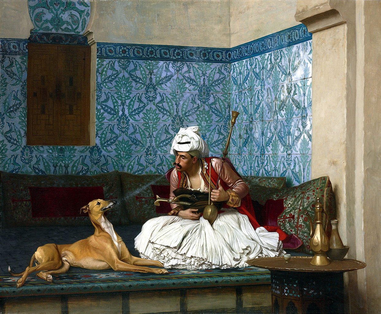


You can create a slideshow of images. It works best if they are all the same size, but these images from Wikipedia vary a bit, so the slide size varies. The carousel is sizeable depending on page width.
The code looks like this
<div class="container">

  <h2>Carousel</h2>
  <p>The Carousel creates a rotating slide show.</p>

  <div id="carousel-example-generic" class="carousel slide" data-ride="carousel">

    <ol class="carousel-indicators">
      <li data-target="#carousel-example-generic" data-slide-to="0" class="active"></li>
      <li data-target="#carousel-example-generic" data-slide-to="1"></li>
      <li data-target="#carousel-example-generic" data-slide-to="2"></li>
      <li data-target="#carousel-example-generic" data-slide-to="3"></li>
    </ol>
    <div class="carousel-inner" role="listbox">

      <div class="item active">
        <img src="https://upload.wikimedia.org/wikipedia/commons/d/d3/Arnaut_and_his_dog_by_Jean_Leon_gerome.jpg" alt="...">
        <div class="carousel-caption">
          Arnaut Blowing Smoke in His Dog's Nose,
        </div>
      </div>

      <div class="item">
        <img src="https://upload.wikimedia.org/wikipedia/commons/5/53/Bristol_Museum_Tadema_unconscious_rivals.JPG" alt="...">
        <div class="carousel-caption">
          Unconscious Rivals, Lawrence Alma-Tadema
        </div>
      </div>

      <div class="item">
        <img src="https://upload.wikimedia.org/wikipedia/commons/c/c0/Ferdinand_Max_Bredt_-_Türkische_Frauen.jpg" alt="...">
        <div class="carousel-caption">
          Turkish Women, Ferdinand Max Bredt
        </div>
      </div>

      <div class="item">
        <img src="https://upload.wikimedia.org/wikipedia/commons/4/46/Leon_Cogniet_-_L_Expedition_D_Egypte_Sous_Les_Ordres_De_Bonaparte.jpg" alt="...">
        <div class="carousel-caption">
          The 1798 Egyptian Expedition Under the Command of Bonaparte, Léon Cogniet, Louvre
        </div>
      </div>

   </div>

    <!-- Controls -->
    <a class="left carousel-control" href="#carousel-example-generic" role="button" data-slide="prev">
      <span class="glyphicon glyphicon-chevron-left" aria-hidden="true"></span>
      <span class="sr-only">Previous</span>
    </a>

    <a class="right carousel-control" href="#carousel-example-generic" role="button" data-slide="next">
      <span class="glyphicon glyphicon-chevron-right" aria-hidden="true"></span>
      <span class="sr-only">Next</span>
    </a>
  </div>
  <br>
  <p>You can create a slideshow of images.  It works best if they are all the same size, but these images from Wikipedia vary a bit, so the slide size varies.  The carousel is sizeable depending on page width.</p>
</div>
Brand X Internet - Telephone 310 395 5500 - Email sales@brandx.net

"Brand X Internet" and the Brand X rocket logos are
Trademarks and Service Marks of Brand X Internet.